Campaign & content
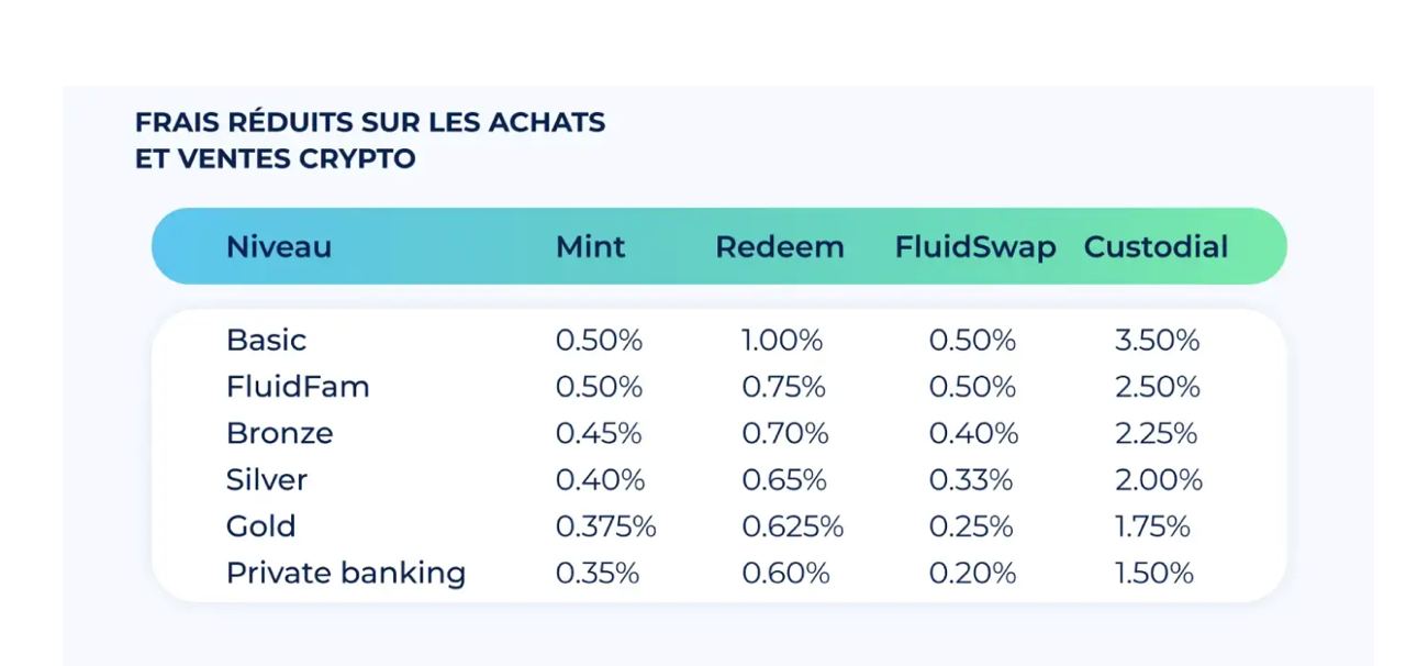
Fee tier comparison table
Fluid Finance · 2022 · Marketing graphic · multi language
Six membership tiers against four fee types in one gradient headed table that reads clearly at social crop sizes.
24
Data points made readable in one glance
2
Languages from one master layout
Reusable
Dropped into decks, site and social
The work
Fee tiers were the strongest acquisition argument and the least readable part of the product. The data lived in a spreadsheet nobody shared.
I designed it as a single card: the Water to Grass gradient header carries the column labels, the tier names sit left aligned in brand navy, and generous row spacing keeps it legible when resized for Twitter or a slide.
Built to be localised; the same layout was exported in French and English without reflowing the columns.
More designs