Brand & identity
Spontaneous · self initiatedeToro logo exploration
eToro · 2026 · Logo options sheet · 9 directions
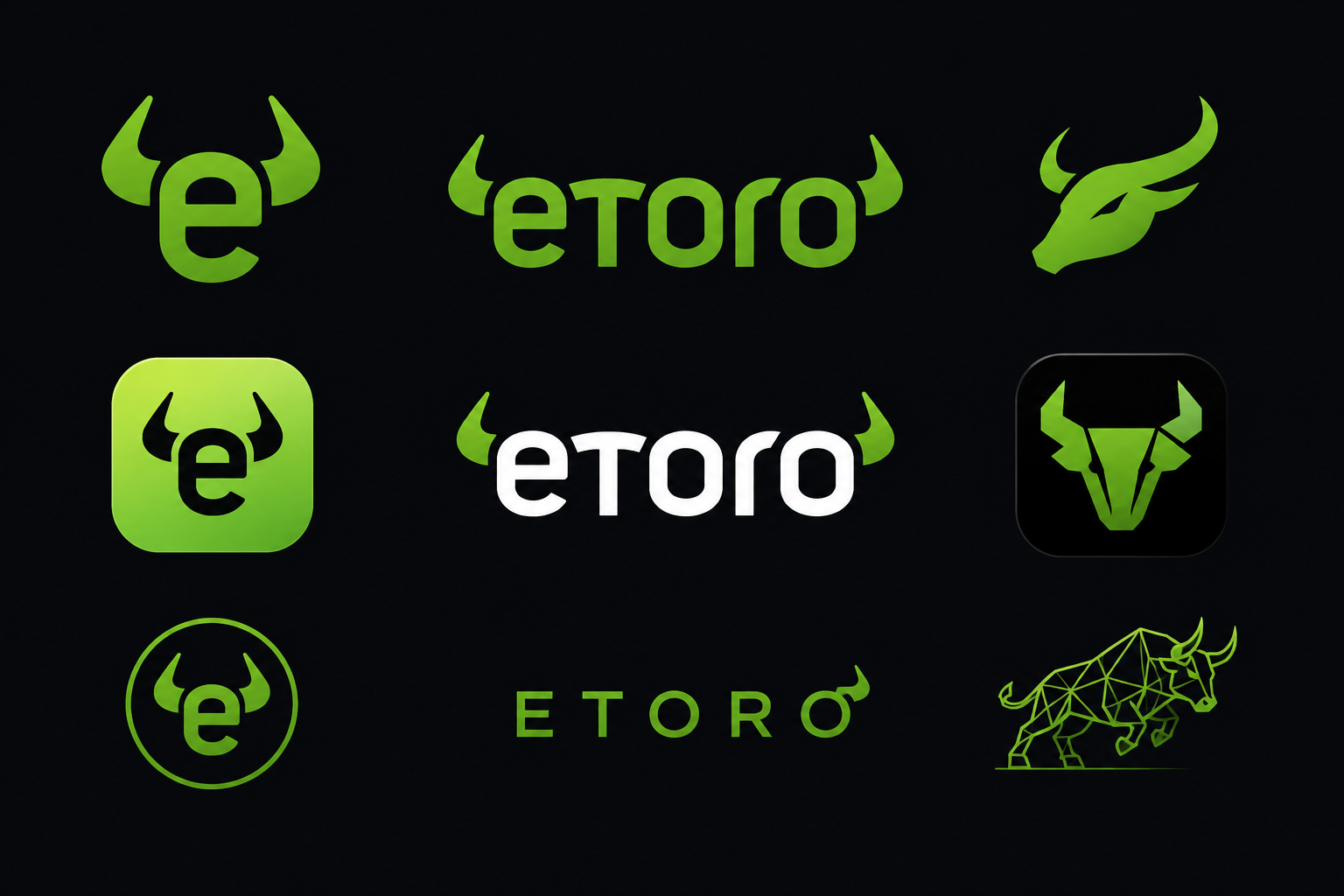
Nine logo directions reinterpreting eToro's bull across minimal, geometric and character led treatments; a spontaneous concept study, not commissioned work.
9
Logo directions on one sheet
Spontaneous
Self initiated concept, not commissioned
Modular
Scales from app icon to billboard
The work
These logo directions were created as a spontaneous design exploration, not as part of a planned or commissioned eToro rebrand. The exercise was to see how the bull symbol could evolve beyond its current form while keeping the brand's energetic green identity intact.
The sheet ranges from subtle refinements, rounding the bull horns into an app icon, encasing the 'e' in horns, to more radical directions including a low poly bull, a wordmark with horn accents and a geometric bull head. Every option keeps eToro green as the anchor colour.
The result is a concept kit that shows how a trading brand can feel premium and investor focused without losing its bullish personality.
More designs